I Review the New Dungeons & Dragons Art, Unwisely
I'm just interested in marketing. I don't want to argue about politics.

It's really dangerous to critique popular fantasy product these days, especially the marketing. It puts you at risk of being sucked into some horrible, interminable culture war argument. However, I write fantasy games for a living, so marketing them is an area of particular importance to me, and I've been playing Dungeons & Dragons for maaaany years.
So let's see how Wizards of the Coast is selling Dungeons & Dragons these days!
(Fantasy marketing is very important to me because our next turn-based indie RPG, in a massive world with a great story, Avernum 4: Greed and Glory, comes out in October. Wishlist now!)
To perform the experiment, I Googled "Dungeons & Dragons,” went to the official link, and pulled out the very first two images they show. As in, for a new person interested in the game, the art that consulting and testing, and 8 levels of management decided would make the best impression on you.
I really like one of these images. The other, I am, perhaps, less of a fan. I had a lot of fun looking at them closely. So let's take a look!

Image #1: The Pastel, Forgotten Realms Heavy-hitter.
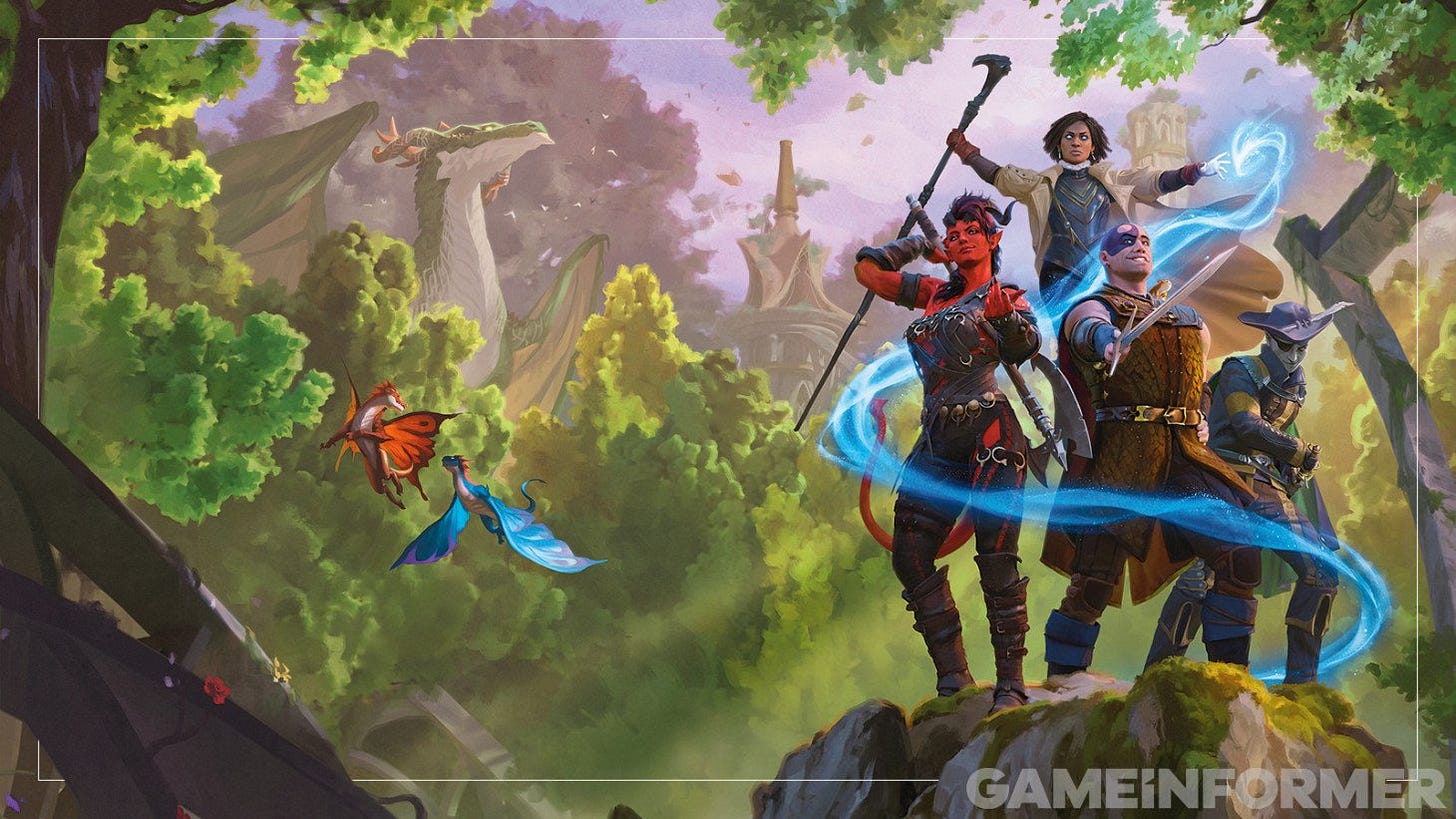
This is D&D's all-important first impression. I've provided the full version (stolen from Game Informer). It’s the cover of one of the new books, a supplement for the reasonably popular Forgotten Realms setting.
Take a good look. Give it a moment. What do you think? What is this image selling to you? What sort of person would see it and say, "I want this in my life."?
I am not a fan of this image, but I suspect a great amount of money and time went into making sure it did not appeal to me.
So I'm not going to say whether it's good or bad marketing. Only WotC's secret sales data will say so. However, I can make some notes about it and what product I think it is trying to sell.
1. It's very pastel and soft focus. Not much contrast, minimal shadows. Kind of flat. A serious break from decades of D&D art style. A strange tonal contrast from the history of the game, which mainly involved butchering bugbears on an industrial scale to bump your sword up to +3.
2, Even more interesting to me is the content. There is no action! It's a bunch of quirky characters in a glamour pose. Like the yearbook photo from Adventurer High School, class of 2025.
Traditional D&D art emphasizes the action. Stealing treasure. Fighting monsters. Getting out of trouble. They are really leaning into selling the podcast model of D&D as improv theater, where you play the wackiest whatever you can.
(I was recently in a D&D game where two players INSISTED on playing Kuo-Toa. You know. The hopelessly evil, subterranean, Lovecraftian human-sacrificers that were originally high level monsters and thus came with a huge suite of innate abilities. That game was ... quirky.)
3. That odd fellow front and center is Minsc, a character from Baldur's Gate 2, a D&D videogame that came out in 1998.
Note Minsc, in addition to all that face ink, has a hamster (!) on his shoulder. That is Boo, who Minsc says is a “miniature giant space hamster.” I didn't play him in Baldur's Gate 2 because I thought he was annoying.
In addition to being featured in a good game of a previous millennium, he showed up in a few cameos of video games since then. For example, he appeared in hour 70 of my Baldur's Gate 3 playthrough. Because of some mystery choice I made, I was forced to kill him forever. I felt nothing.
But Minsc is currently the veeeery first adventurer the person curious about D&D is meant to see. A grinning weirdo with a hamster. Sorry, I meant a "miniature giant space hamster.” All this is very improv comedy. On brand.
4. The other characters in the group are people from the Forgotten Realms universe. Outside of Forgotten Realms, nobody will have any idea who they are. But they look pretty fantasy, so it's fine.
(The first reason to select these characters, I would think, was to sell copies to Forgotten Realms fans and to those who are interested. Yet, the character in this setting who has the most popular culture traction is definitely the conflicted dark elf warrior Drizzt, with the bonus that he looks super badass, and yet he’s not here. Odd. A shame to leave such a strong trademark on the shelf.)
5. The others are nice and adventurey, in a more generic way. In classic D&D fashion, they did make sure to include an extremely hot demon girl with huge breasts, a come-hither stare, and bondage gear. I want to buy a van so that she can be painted on the side of it.
Normally, there would be complaining about how not-realistic her armor is. Not hearing any carping about her. So some of this marketing is still VERY traditional.
("That's not a demon girl! It's a tiefling!" NOBODY KNOWS WHAT THAT IS!!!)
6. Since it is Dungeons & Dragons, there does need to be a dragon. You can see a giant one to the left, hiding behind a bush looking vaguely stoned.
That dragon doesn't look super-dragony, so they included two bonus dragons in the foreground who are apparently about to totally make out. I am increasingly unsure what is supposed to be going on in this art.
Again I must point out that, to be where it is, this art had to be approved by many people in many meetings. I can imagine the reams of notes that were involved. ("Can the tiny blue dragon look 20% hornier?")
So what exactly is the purpose of dragons in D&D? They used to be awesome endbosses, terrifying legends from the depths of time, lurking in the shadows ready for epic battles and huge loot drops. In other words, to an old grognard like me, prime D&D fodder. Is this still the case?
Anyhoo. Fantasy games are always aspirational. They are power fantasies, but power can mean many, many things. So what fantasy is being sold here?
This art is not about aspiring to do. It's about aspiring to be. Not doing awesome things but just being generally awesome, in a magical place where the buildings are nice and elfy and even the dragons are chill. Also, demon girls will go out on dates with you.
It's a very bold shift from the past, a dramatic and focused change in what this game is meant to be ABOUT. I think it's really interesting.
Is this good or bad art? We’ll find out. If it sells copies, it’s good. If not, it’s bad. I really want to know if this style sells.
Image #2: The Hot Action Sales Pitch.
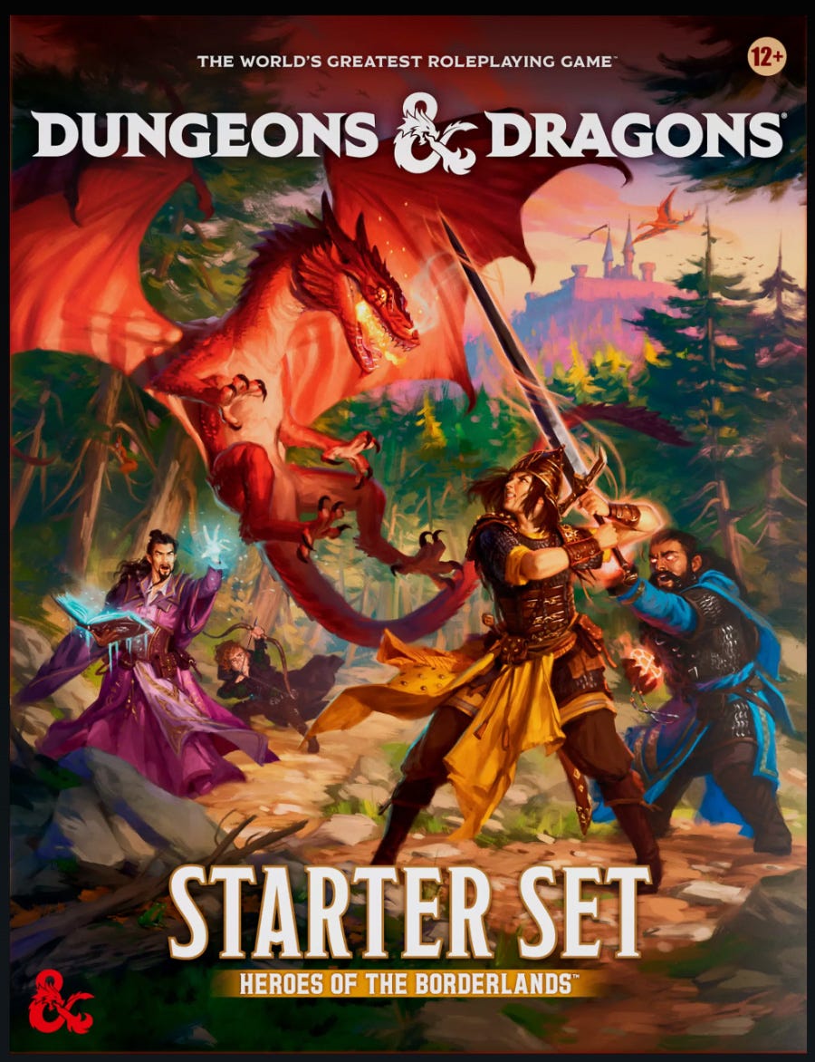
The second image on the main page was this, smaller and to the right of Image #1. It's the cover of the starter book, the book that is intended to be for the new player.
Again, take a good look. What is this image selling to you? What sort of person would see it and say, "I want this in my life."?
The first thing I notice is that they really locked in here. It's still pretty pastel and soft focus (and too busy), but they are really trying to both attract people to the game and explain what this game is about. It's selling a very different game than Image #1.
There is a lot of information here.
Some observations:
1. It's an action pose! Something is happening! It's a very clear fight with a very clear bad guy who really means business. (The dragon's expression is really nicely done.)
(Tangentially, the second dragon over the castle isn't great. Perspective is weird. In fact, the composition of the whole piece is a bit odd. The dragon is behind the fighter. The hobbit is aiming who knows where? The dragon is falling backwards. Is it drunk? And yet, absolutely none of this matters. The VIBE works.)
2. The adventurers are far less strange. There are still humans in D&D? Who knew?
But, more importantly, note that they are the standard party mix. Fighter. Cleric providing support. Wizard and cowardly rogue in the background sneaking in damage. This image is doing a lot of heavy lifting explaining not just what this game is about but how it is played in practice.
3. Is that a giant squirrel on a branch to the left?
4. There is a LOT in this image. Perhaps they put a little too much icing on the cake?
The wizard is holding his spellbook, and it also has little icicles on it. The priest isn't just blessing the fighter, he's sending light tendrils all the way to the dragon, plus he has a glowy egg in his off hand for reasons. And the lady fighter should perhaps have left her yellow scarf collection at home. It's gonna get all burned up. This art is very noisy. Almost like they don't entirely trust the appeal of the game they're selling.
But I'm being picky. I think this art makes some really weird technical choices, and yet it totally works. Ten year old me would buy this game.
(But the age at the top right is 12+? Boooo! D&D rights for 4th graders!)

By The Way, It Doesn't Matter
It's fun to complain about D&D because it won't make any difference. D&D will never fail. It will always reign. It will be the default tabletop RPG for as long as you walk this Earth. It is the best example of the First Mover Advantage.
Everyone loves being angry at D&D because it's the safest possible opinion. Complaining about D&D is like punching a giant pillow. The pillow doesn't notice.
No, your favorite obscure RPG will not rise to dethrone D&D. The world is not going to be taken over by SHMURPS or Swordfinder or Vampire: The Vampiring. Not enough people care enough to generate critical mass around another title.
If you are mad at D&D and lust for revenge, you can play Second Edition instead. That'll show 'em!
I just wanted to make sure you knew.
Spiderweb Software creates turn-based, indie, old-school fantasy role-playing games. They are low-budget, but they’re full of good story and fun. We have announced our next game, Avernum 4: Greed and Glory. Wishlists are greatly appreciated.
This newsletter is free. However, the existence of paid subscribers makes me feel guilty if I don’t update it enough, which results in more posts.


If you look at Star Wars New Hope poster, you'll see Luke striking heroic pose, Leia striking a pose that's not heroic at all, and Darth Vader not doing anything evil in particular, but his head being several times larger than the Death Star. Which is not necessary how he's depicted in the movie, but it makes sense in the framework of the movie poster language.
I think that the first picture employs movie/anime/manga cover language, selling the idea that "you'll get a story as good as your favorite adventure media", rather than directly depicting the gameplay. "You know what happens in your favorite manga, well, in D&D you'll get all the same and more, because the cover is similar!"
I've got to admit the first piece of artwork doesn't appeal to me at all, but that's fine, it's been clear for a long while that I'm not the target audience for the latest edition of D&D. It's not like there's any shortage of other games though, and it's never been easier to play earlier editions, retroclones and like, so I'm not going to get too steamed.